


.svg)
The Scope
The Problem
Politics, religion, & abortion: topics to avoid. Abortion care has been largely politicized and made into a national moral debate, causing it to be a topic that many avoid and consider taboo.
Because of this, the general population knows very little about abortion care, and yet 1 in 4 women will have an abortion by age 45.
This lack of knowledge directly affects people’s ability to receive safe abortion care.
This effects everyone—however, it primarily affects those who live in rural communities and are in a lower socio-economic class.
There are a total of 8 abortion clinics in the state of Arizona, serving a population of 6.3 million. 1 of those 8 clinics is Camelback Family Planning.
The company
Camelback Family Planning is a small business located in the heart of Phoenix, Arizona. They specialize in abortion care and miscarriage management. The clinic launched their initial website in 2000 and since then has seen over 10,000 patients.
As the clinic’s demand grew, it became obvious that the previous website was not fulfilling its function of providing information about abortion care. This was apparent by the number of calls the clinic received daily asking the same questions about the process.
The website was failing to provide information to its users in a way that was easy to absorb and retain.
The goals
The main goal of the redesign was to make learning about abortion care easier and more accessible.
A user’s experience with the Camelback Family Planning site is unique. In most instances, the user is distracted and has difficulty focusing, yet they are faced with the task of navigating this turbulent topic.
Many barriers to entry have been implemented in Arizona to make it difficult for people to get an abortion. The most obvious one is the requirement to have two separate appointments over the course of at least 24 hours. This means that patients must plan to be at the clinic two separate times over the course of two days. This can mean additional lodging costs, added days off from work, prolonged babysitters, and further barriers.
To avoid major inconveniences, patients must understand these processes.
To measure our success, the following goals were established:
Increase the number of users by
10%
Decrease the number of calls by
25%
Reduce the bounce rate to
40%
The constraints
This was a project for a real company, intended to be used by real users.
As one of my first UX Design projects, this was a tall task. I had to design and build a website that receives approximately 4,500 monthly users. Juggling user needs, stakeholder asks, and learning as I go was a journey, to say the least.
show me the data
show me the data
show me the data
show me the data
show me the data
show me the data
show me the data
show me the data
show me the data
show me the data
The Research
overview
Given the nature and sensitivity of this medical process, I chose to focus primarily on first-hand observation and survey data to minimize my disruption.
I spent two months at the clinic, observing and helping. I focused primarily on answering questions over the phone and in person, but also assisted with checking patients in and out.
Through these interactions, it was apparent that information on the site was not being absorbed or accessed.
The staff reiterated that they answered the same questions every day.
Additionally, it became obvious that the clinic saw patients of all races, ages, and situations. Therefore, there was no specific end user. Boxing in the end-user to a specific set of parameters would only limit the redesign.
The only constant was the user’s need for accessible information.
survey results
To further my understanding of the gaps the current website was leaving, I conducted a digital survey which collected 91 responses. The conclusions are outlined below.
had difficulty finding information about the abortion process
23%
had difficulty finding information about the fees
41%
had difficulty finding information about financial assistance
51%
Based on my observation and survey data, I created empathy maps, pain points, personas, and user stories to start to paint a picture of the user’s wants, needs, and fears. These items are fully documented in the User Research Report.
key insights
The key insights derived from the research are summarized below.
Abortion care is not common knowledge.
Information is difficult to find or outdated on the current website.
People are skeptical of abortion clinics and need to determine their validity before they feel comfortable.
People get abortions for a variety of reasons and are in a variety of headspaces.
Everyone gets abortions.
Let's create a solution
Let's create a solution
Let's create a solution
Let's create a solution
Let's create a solution
Let's create a solution
Let's create a solution
Let's create a solution
Let's create a solution
Ideation
Competitive Audit
I conducted a competitive audit to understand the features competitors were utilizing on their websites. Five websites, three direct and two indirect competitors, were analyzed, and the full results are documented in a Competitive Audit Report.
From the audit, I was able to identify gaps in the market and opportunities to better the user’s experiences.

content audit & inventory
I performed both a content audit and a content inventory in order to answer the following two questions:
What content does the website have?
Q
&
Is this content valuable to the user?
Q
results
A
22
total pages
19
outdated pages
10
pages that are difficult to find
The navigation is confusing and makes it difficult to find certain pages
The site is difficult to skim because of excess text and limited formatting
Pages can be combined to reduce the complexity of the site map
Lack of adequate whitespace
Outdated information
site map
To increase users' understanding and retention of the abortion care process, I simplified the site map. I reduced the number of pages by combining topics, improving taxonomy, and curating the content with the stakeholders.
before

&
after

sketching & wireframing
testing & iterating
sketching & wireframing
testing & iterating
sketching & wireframing
testing & iterating
sketching & wireframing
testing & iterating
The Design Process
ideation cycle
My design process was broken into two cycles: the Ideation Cycle and the Testing Cycling. The Ideation Cycle went back and forth between sketching and creating digital wireframes in Figma.

Each instrument had its own benefits and drawbacks. Sketching allowed me to quickly illustrate my thoughts and ideas, whereas creating digital wireframes resulted in cleaner results.
The two worked together to lay the groundwork for the site.
sketch
Sketching consisted of building the information architecture, developing the hierarchy, and considering the layout. This manifested itself in sketches, scribbles, and wireframes.
Initial Sketches and Paper Wireframes
digital wireframes
Digital wireframes involved building the site layout inside of Figma. This focused on executing layout and hierarchy.

Final Digital Wireframe
testing cycle
The Testing Cycle focused on iterating through user-generated feedback. I gathered user-generated feedback by conducting two rounds of usability studies. By testing the prototype, I gathered insights through the user’s interactions. These insights fueled actions that were used to improve the design.

testing
A usability study plan was written for each usability study done. Within this plan, I outlined the research questions, key performance indicators (KPIs), methodologies, and information pertinent to each participant.

Excerpt from Usability Study
Once the plan was established, I outlined a script to be delivered during the usability study. The script included an introduction, an explanation of the usability study, a scenario, and various prompts. This was created to ensure all the questions given to participants were consistent.

Excerpt from Usability Study Script
Each session was recorded through a voice memo application. After each usability study, I transcribed the recordings into actions to be done for the next iteration. I organized these actions into a table that categorized each by the specific page they affected, the urgency, and the type of correction. As I went through the iterations, these were either marked as "Completed" or "Left as is".

Excerpt from Observations
iterating
At the end of the testing cycle, I had an improved prototype. This would then lead to another testing cycle to further improve the site. After three usability studies, the pain points were few and far between.

Mock-Ups after Second Usability Study

Mock-Ups after Third Usability Study
design solutions
Based on the initial research done, there were certain constraints and pain points to address in the redesign. Some solutions are highlighted below.
mobile first
85% of users visit CFP's website from a mobile device.
Based on this majority, it was imperative to take a mobile-first design approach in the redesign.
Once the initial design was curated specifically for a mobile experience, the design was then further curated for desktop and tablet screens.


expandable text boxes
Even after cutting back over half of the text from the current CFP site, there was still a lot of content. Due to the limited horizontal space on mobile devices, this would have resulted in excessively long pages.
To offset the amount of information and keep the page count low, I decided to utilize expandable text boxes.
Expandable text boxes allow the user to control the information they see. If a prompt sparks curiosity, the user can expand it; if not the content remains hidden from view and the user can continue to scroll.
This allowed the site to appeal to a variety of users that required different amounts of information to feel comfortable.
scannable
Based on observations, it was apparent that certain users were stressed. Which could have hindered their ability to remember and absorb information.
To create a more informative experience for the user, I created various visual elements to draw the users' attention and create distinct hierarchy.
1
Warning Boxes
During user testing, it became apparent that participants were missing certain pieces of critical information.
To help, the warning box visual was designed. The warning box visual is used for information that, if not obtained, would result in a poor user experience at the clinic for the patient.

2
Comment Bubbles
The comment bubble visual was implemented to emphasize specific questions users may have. It was intended to be less intense than the warning box but still grab users' attention.
3
Bolding
The last and most subtle visual element implemented was simply bolding specific text that allowed the user to easily scan bodies of text and extract the most crucial information.
so, what changed?
so, what changed?
so, what changed?
so, what changed?
so, what changed?
so, what changed?
so, what changed?
so, what changed?
so, what changed?
so, what changed?
Before & After
The following are some (not all) examples of the changes made to the site to improve the user experience.
the home page
To increase accessibility to abortion care, my main goal was to make finding information on abortion care easier. This all started with the home page. Prior to the redesign, the home page lacked a clear call-to-action (CTA), had disjointed navigation, and lacked purposeful content.
In the redesign, clear CTAs were added to allow different end-users quick access to the desired information; the overall navigation of the site was condensed and made available via the main navigation bar; and lastly, a photo gallery, testimonials section, and contact us form were added to help instill confidence in the site and help answer initial questions.
Previous Home Page
Current Home Page
the our physicians page
Previously, the Our Physicians page was not accessible from the home page. Additionally, the content was outdated, and the page only focused on one of five physicians working at the clinic.
Now, the Our Physicians page highlights all five doctors, is easily accessible through the main navigation bar, and the main reasons to go to the clinic are highlighted in a way that is easily absorbable.
Previous Our Physicians Page
Current Our Physicians Page
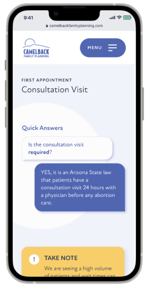
the Abortion care page
Previously, the information relevant to abortion care was spread across four pages. This caused users to misunderstand the abortion care process and, in many cases, miss critical information regarding the consultation visit.
In the redesign, I wanted to ensure the consultation visit information would be seen. To do this, it was placed at the top of the page and emphasized with various principles of hierarchy. Additionally, all the information relevant to abortion care was combined into one main page. By implementing expandable text boxes, the user was able to scroll through the information with ease and interact with elements that sparked curiosity.
Previous Abortion Care Page
Current Abortion Care Page
the financial info page
Before, the information on fees and financial assistance was not accessible via the main navigation, and the content was wordy and lacked hierarchy. This made it difficult for users to find the information they were looking for.
In the redesign, information pertaining to finances was grouped onto one page and the information was condensed. This allows users to quickly scan the content and find critical information quickly.
Previous Financial Info Page
Current Financial Info Page
FINISHING TOUCHES
FINISHING TOUCHES
FINISHING TOUCHES
FINISHING TOUCHES
FINISHING TOUCHES
FINISHING TOUCHES
FINISHING TOUCHES
FINISHING TOUCHES
FINISHING TOUCHES
FINISHING TOUCHES
The Final Product

in conclusion
in conclusion
in conclusion
in conclusion
in conclusion
in conclusion
in conclusion
in conclusion
in conclusion
in conclusion
in conclusion
in conclusion
in conclusion
in conclusion
in conclusion
in conclusion
in conclusion
in conclusion
in conclusion
in conclusion
in conclusion
Conclusions
impact
After finalizing the design, the site was created using Webflow. The official Camelback Family Planning was launched on December 17th, 2021 and is currently being used by the company.
I have gathered site data via Google Analytics and compared it to the previous metrics. The results are as follows:
Increase the number of users by
8%
Decrease the number of calls by
23%
Reduce the bounce rate to
42%
next steps
The continued mission of the website will be to increase accessibility to information on abortion care. Moving forward, I plan to continue to work with the CFP team and evolve the site as their policies change in response to changes in abortion laws.
reflections
This was my first major UX design project. It was a large undertaking but was fueled by my passion for accessibility to basic healthcare and UX design.
However, upon reflection, there are certain elements that could have been streamlined and improved.
1
Utilize User Interviews
Utilizing survey data helped to gather initial research on the user’s experience without causing a disruption to patients at the clinic, but it did not fully encapsulate their experiences. Many of the users responded positively to the website but then proceeded to have many inquiries about the process and company. It became apparent that users were not aware of the information they were being denied.
In the future, I would attempt to conduct some user interviews for those that were willing, to fully understand the user’s experiences with the site.
2
Adjusting Design Methodologies
I utilized Figma for this project. As the project progressed, so did my knowledge of Figma. Because of this, I had to go back and restructure aspects of my project to conform to a specific design ideology I had adapted to, for example, implementing auto layout.
in conclusion
I am very grateful for the opportunity to work on this project and be able to create a finished piece that will have a positive impact on people’s lives.


